


Whether you’re hiring or just exploring, I’d love to connect.
mail@felix.pm

When I joined, Better Collective’s visual system consisted only of a logo, a free font, two colors and no guidelines - a minimal framework that failed to reflect the company’s growth, global scale, and evolving role and impact in digital sports media.
Quick Summary
Led the full rebranding of Better Collective, transforming a minimal logo system into a scalable global identity across digital products, marketing, employer brand, and physical offices. Defined typography, color, motion, and design frameworks, redesigned the website, and implemented way-finding for HQ. Result: company-wide adoption, stronger consistency, and a brand aligned with strategic ambition.
In the first year of my employment, the organization made a strategic shift from being a performance marketing affiliate company to a visionary, global digital sports media group. With that ambition came an internal pet peeve shared across teams - a brand and visual language that felt incomplete, inconsistent, and under-representational of our people, products, and purpose. I took it upon myself to change that, with the help of three other designers in the Design department who each excelled in Identity Design, Digital Design and Graphic Design.
This initiative became a high-stakes internal transformation, touching everything from the corporate identity system and digital presence to employer branding and global physical environments.
This project was uniquely suited to my expertise. My deep grounding in strategic branding, systems thinking, and design leadership equipped me to unify disparate visual assets into a cohesive system. My firsthand experience with gaming user interfaces and dynamic visual ecosystems informed how I approached flexible, intuitive, and expressive design frameworks - vital in a company with products spanning editorial, data tools, community platforms, and B2B experiences.
I began by defining a clear, contemporary identity system that balanced visual flexibility with structural discipline. Core elements included:
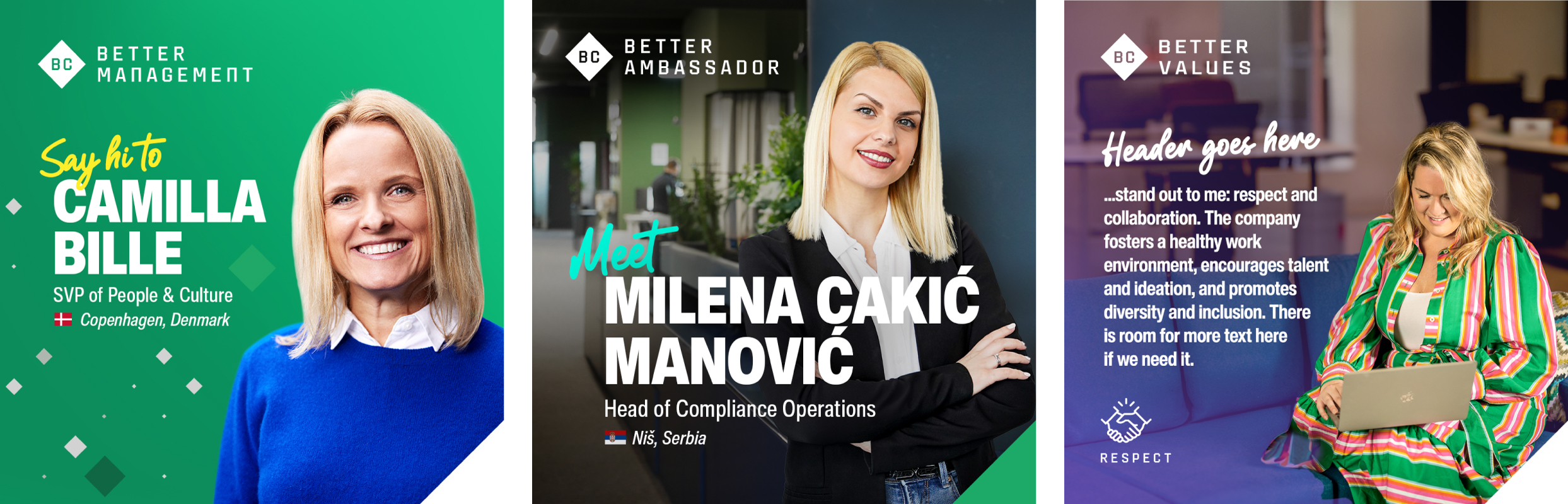
The conceptual backbone of the identity was built around a simple but powerful idea: the word “Better.” For a company called Better Collective it may seem obvious, but that obviousness is precisely its strength. The concept allowed us to frame every part of the organization through a shared ambition - Better Management, Better Employees, Better Values, Better Products - even extending playfully to everyday details like Better Restrooms. By applying “Better” as a unifying lens, the identity became more than visual expression; it turned into a mindset that encouraged constant improvement, pride in craftsmanship, and a common language across teams and touchpoints.
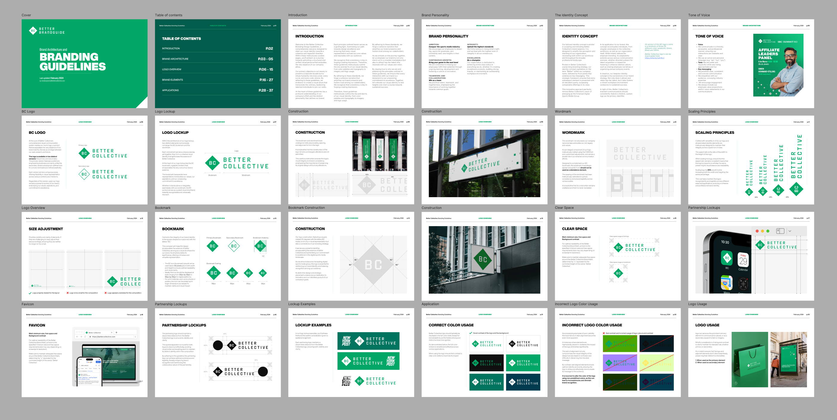
Typography became a central pillar of the identity work. Rather than making this decision in isolation, I utilized the scale and diversity of the design department and facilitated a full-fledged typographical workshop involving designers across disciplines. Over several days we researched, tested, and debated which typeface could best support both the Better Collective brand expression and the very practical demands of generic way-finding, digital products, and corporate communication.
The process included print tests at multiple sizes, distance-legibility studies, signage mockups, and on-screen rendering comparisons, ensuring the typeface performed consistently from mobile interfaces to large-format environmental graphics. We also evaluated multilingual support and accessibility, focusing on character sets, diacritics, numeric clarity, and compliance with readability standards for diverse user groups.
The conclusion was to adopt Helvetica Now - an updated edition of perhaps the most iconic typeface of all time. In this release, every single glyph of Helvetica has been redrawn and refined, marking a new chapter in its history while preserving the Swiss mantra of clarity and neutrality. Helvetica Now gave us the precision, versatility, and timeless authority needed for a global organization operating across products, media, and spaces.
This identity wasn’t just cosmetic - it was engineered to scale, ensuring seamless application from marketing campaigns to corporate communications, from digital products to physical environments.
Simultaneously, I led a redesign of the Better Collective website, shaping a more intuitive, content-forward platform that elevated the company’s narrative and product ecosystem.

Recognising that talent and culture were a competitive advantage, I also developed a distinct employer branding system with help from one of the more brand focusd designers in the design department. We needed a brand platform that communicated Better Collective’s values and talent story to global candidates. This included visual frameworks, messaging architecture, and flexible templating that supported growth hiring and recruitment marketing. To support the internal rollout - especially as teams grew to over 2,500 people across the world, we defined internal identities and guidelines, ensuring local teams could apply the brand consistently, regardless of geography or channel.


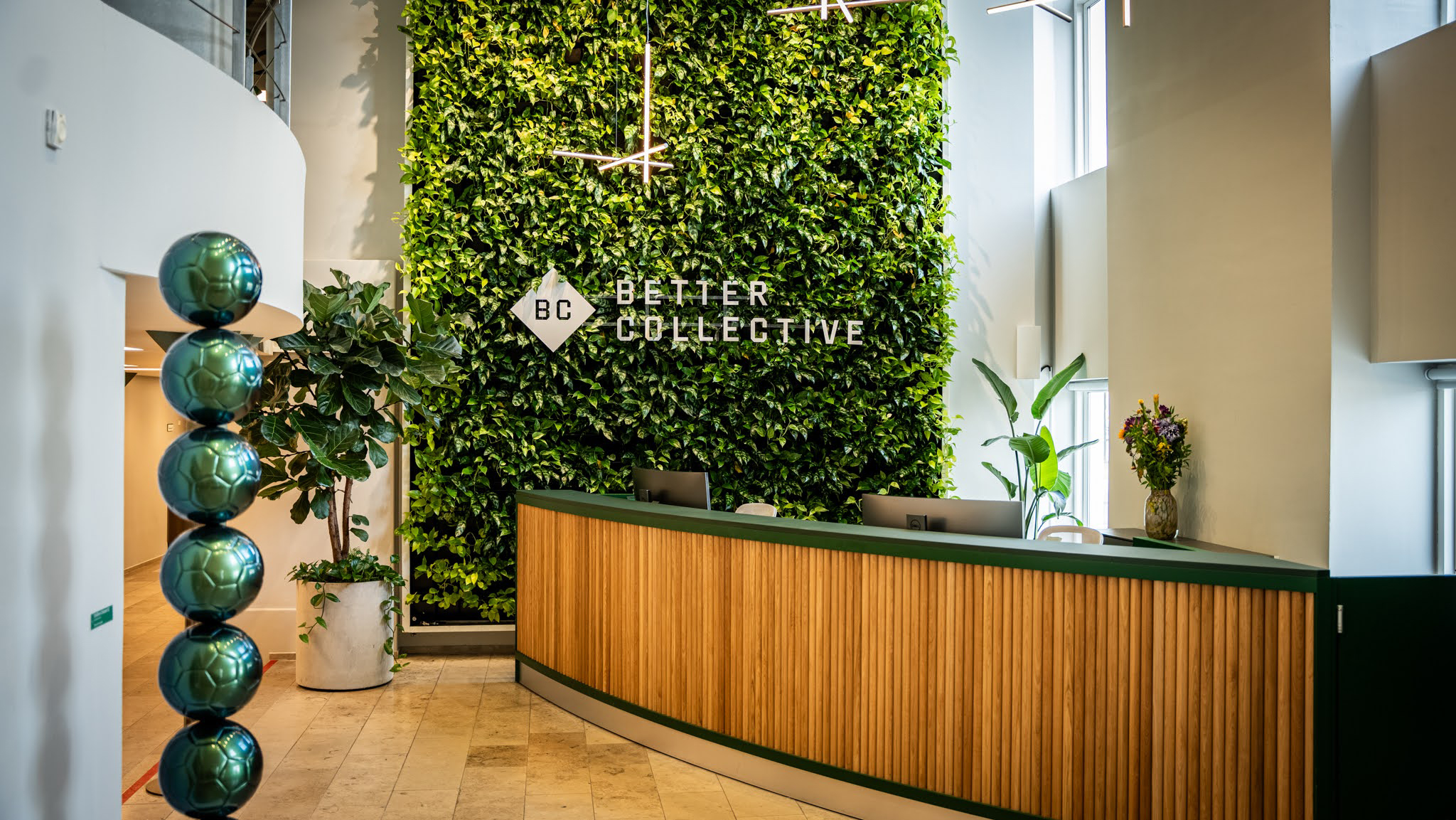
The relocation to our historic headquarters in Sankt Annæ Plads provided an opportunity to extend the brand into physical environments. I led the development of a signage system and office design guide that tied visual identity into built space - helping unify environments from Denmark to our global offices and reinforcing culture through place. To ensure the best possible solution, I collaborated closely with architects and professional way-finding specialists, aligning brand expression with spatial logic, user flow, and architectural intent. Together we developed a coherent system that balanced aesthetics with function - covering exterior signage, internal navigation, meeting room identification, and environmental graphics - so that every office felt unmistakably Better Collective while remaining intuitive and human to navigate.
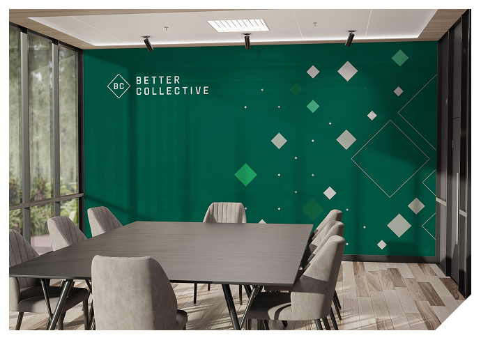
To give the updated identity a truly distinctive signature, we introduced a fifth visual element built from two related components: the Diamond and the Cut Corner. Both originated from the simple geometry of Better Collective’s bookmark symbol - a perfect square rotated 45 degrees - and were designed to become instantly recognizable carriers of the brand.
The rotated square, affectionately dubbed “the Diamond,” became the foundation for a system of never-ending generative patterns. Designed patterns play a significant role in BC’s brand communication by contributing to and reinforcing the visual identity. Unlike most other brand elements, these patterns can be updated or modified to align with design trends or seasonal themes, keeping BC’s expression fresh and relevant without the need for a full identity overhaul.
This flexibility allowed the brand to feel dynamic and contemporary across web, social, events, and interiors while still remaining unmistakably Better Collective.
The second component was derived from one side of the Diamond: a 45-degree triangle placed in the bottom-right corner of all materials. This element could appear as a colored overlay or as a white “cut-out,” creating a distinctive corner treatment. The ambition was to craft an identifier so strong that - much like Nike’s swoosh or McDonald’s golden arches -the corner alone would signal the sender.
To ensure consistency across every format, we defined a precise formula based on proportional logic:
the side of the Cut Corner equals one-sixth of the narrow side of the frame - width for portrait, height for landscape - with results rounded according to standard mathematical rules. This rule enabled predictable application from business cards to billboards, photography crops, and digital banners.
Together, the Diamond patterns and the Cut Corner gave the brand a recognizable rhythm that worked across motion, print, UI, and spatial design. They bridged creativity and governance - allowing designers freedom to compose endlessly varied expressions while ensuring every touchpoint felt part of one coherent family.
This holistic identity transformation elevated Better Collective’s visual language, strengthened internal alignment, and enhanced how we presented ourselves to partners, users, candidates, and audiences worldwide.
Key outcomes included:
This project stands as one of the most significant brand initiatives in Better Collective’s history, driven by internal conviction, strategic clarity, and design leadership - and it reflects my commitment to building design systems that not only look good but work “better”.
